What Software Is Used for Creating Plots in Academic Papers?

In summary, when creating plots for papers in particle physics, there are various options for software and programs to use. Some common ones include ROOT and python libraries like matplotlib, but gnuplot can also be used for all of these plots.
  • #1
kimi
1
0
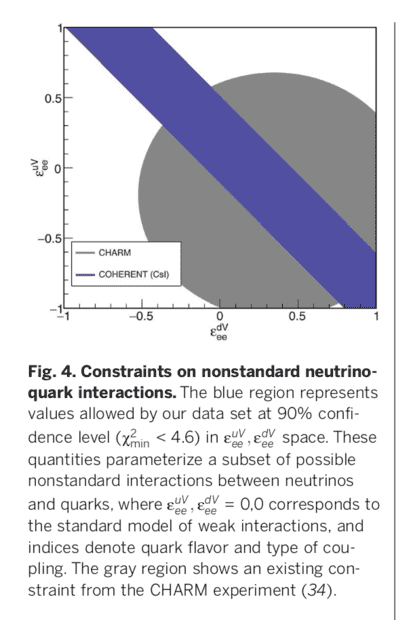
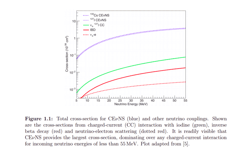
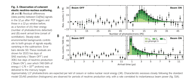
Usually in papers there are many plots, and sometimes I do not understand how they plot them, with which kind of software or program they are plotted. I just attached three of the plots, I would be very thankful if you guide me, any of them is plotted with using which method, software or program.

Thanks
Screenshot from 2021-07-19 08-04-39.png
Screenshot from 2021-07-19 08-04-14.png
Screenshot from 2021-07-14 20-13-18.png
 
Physics news on Phys.org
  • #2
In particle physics many plots are made with ROOT, but python libraries like matplotlib and various other plotting tools are used as well.
 
  • Like
Likes vanhees71 and ohwilleke
  • #3
I am not familiar with this field of physics, but I use gnuplot. All these plots can be done with gnuplot if you are interested.
 
  • Like
Likes vanhees71

Related to What Software Is Used for Creating Plots in Academic Papers?

1. How do I choose the appropriate type of graph for my data?

The type of graph you choose should depend on the type of data you are presenting and the message you want to convey. For example, if you want to show a trend over time, a line graph would be most suitable. If you want to compare different categories, a bar graph would be a better choice. Consider the purpose of your data and choose the graph that best represents it.

2. What is the best way to label my axes?

The axes of your graph should be clearly labeled with the name of the variable and the units of measurement. Make sure the labels are easy to read and understand. You can also include a brief title or caption that explains the purpose of the graph.

3. How do I ensure my data is accurately represented in the graph?

It is important to accurately plot your data points on the graph. Use a ruler or gridlines to make sure the points are evenly spaced and aligned with the axes. If you are using software to create your graph, make sure the data is entered correctly and the graph is generated accurately.

4. Is it necessary to include error bars in my graph?

Error bars can be useful in showing the variability of your data and indicating the level of uncertainty. However, they are not always necessary and it is up to your discretion whether to include them or not. If your data has a small range and the error bars are too small to be visible, it may be better to omit them.

5. How can I make my graph visually appealing?

A visually appealing graph can help draw the reader's attention and make your data more engaging. Use appropriate colors and fonts that are easy to read. Avoid cluttering the graph with unnecessary elements and make sure the data stands out. You can also consider adding a legend or annotations to explain the data further.

Similar threads

  • Atomic and Condensed Matter
Replies
1
Views
902
  • High Energy, Nuclear, Particle Physics
Replies
1
Views
288
  • High Energy, Nuclear, Particle Physics
Replies
7
Views
2K
  • Introductory Physics Homework Help
Replies
14
Views
1K
  • Programming and Computer Science
Replies
3
Views
1K
  • Programming and Computer Science
Replies
2
Views
1K
  • High Energy, Nuclear, Particle Physics
Replies
12
Views
2K
  • Computing and Technology
Replies
15
Views
3K
  • MATLAB, Maple, Mathematica, LaTeX
Replies
4
Views
1K
  • STEM Educators and Teaching
Replies
5
Views
713
Back
Top